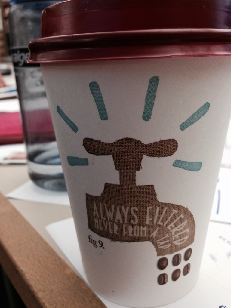
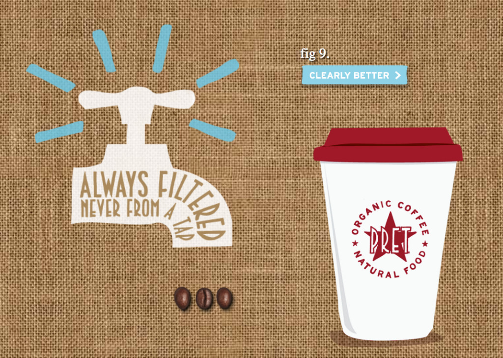
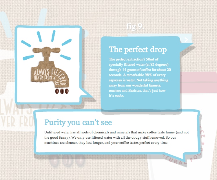
In an impressive integrated campaign Pret A Manger, a high street food chain, highlights all the things that make their coffee great. Adorned on the side of coffee cups are a rotation of various figures. These figures correspond with content on a Pret microsite.
It’s well documented that the nature of water in coffee can really affect its taste. Pret is a reasonably priced food and drink chain. It’s not a premium cafe or an espresso bar. It is not artisan coffee by any stretch of the imagination. It’s mass market. Moreover, Pret’s coffee is good, which has more to do with the care of their baristas and the quality of their beans and the fact they aren’t just pushing a button on a machine. This is why it’s hard to be comfortable with the illustration on the side of the coffee cup promoting the absence of tap water in Pret’s coffee.
There’s a big difference between saying ‘we use filtered water’ versus ‘never from a tap’. This negative messaging suggests there is a problem with tap water. Also, why use a beautiful illustration of a tap to show this? The messaging is confusing.
I love Pret. But I love tap water more. And I can’t support a place that is actively encouraging people to turn away from tap. For many places in the world, tap water is a luxury, let alone a cup of coffee and we shouldn’t be promoting messaging that suggests tap is an inferior alternative.
Ps – This poster by Lucy Vigrass for Do The Green Thing is my kind of illustration. Pure tap love.


