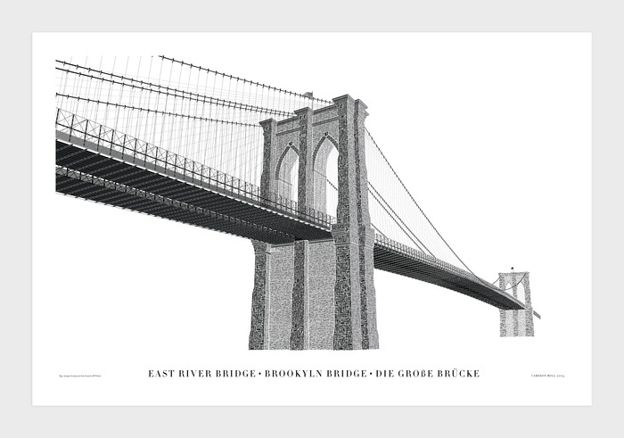
September marked my first ever trip to NYC. I’d been to New York State before but never to the capital*, and I really loved it. I came back to London and instantly declared love. Shortly there after, a good friend of mine got me a Thanksgiving gift: a limited edition print of the Brooklyn Bridge re-imagined in type. The poster was a project on Kickstarter when anyone anywhere could back the idea, and in exchange for pledging cash towards the project, the donor would receive one of the prints. Mine arrived on Friday and it’s rather beautiful.
Now for a little bit of controversy; there’s a typo.
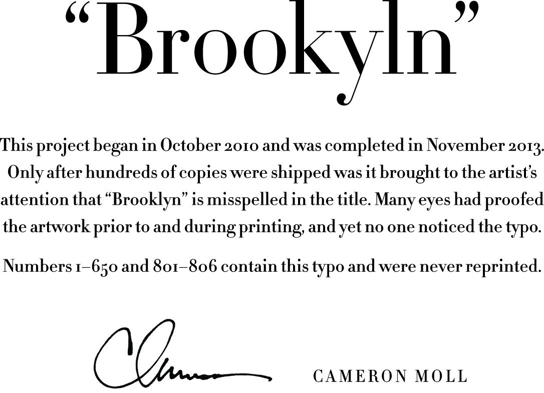
The first thing I thought when the mistake was pointed out to me was how stressful that must be for Cameron Moll, the artist. Having received so much support and praise online for the project, only to have such a major oversight go unspotted for so long and then to have a flood of angry and annoyed backers. Not a smooth ride. The typo – which is the misspelling of Brooklyn – appeared on the render and project page since day one. Countless people saw it and didn’t notice until around Christmas when one of the first recipients of the poster emailed Cameron. Cameron writes on his Kickstart page,
“Apparently this typo has been in the artwork nearly since day one, as the title is one of the first things I add when starting a new piece—it’s usually the easiest thing to figure out. Hundreds of times I’ve looked at the artwork and never noticed it. I even kerned the title’s characters by hand on more than one occasion and didn’t pick up on it. And this is in addition to the dozens of people with whom I shared a printed proof throughout the printing process”.
It’s actually quite hard to spot because cognitively we process information by groupings of things like letters. When reading, we whizz past words without properly reading them by memory and the fact that all the letters look right, regardless if they’re in the right order. It’s no wonder the error went so long unnoticed.
Cameron has offered many solutions for his backers as to what to do next. People can receive new prints without the mistake or they can keep their old one. Having read all of the comments and updates, I have decided to keep mine as is, typo and all, for three reasons.
1. It will be an excellent story to share with friends that come to my flat. I can make it a game and see if they can spot the mistake.
2. People use Kickstarter to raise funds for projects that wouldn’t get backed via other mediums. You are backing an idea first and foremost. For most projects, Kickstarter recommends in its T&C’s that projects offer backers ‘rewards’ as something in return for the support. Kickstarter isn’t a shop or a service. It’s a place for ideas to come to fruition. Even ideas that aren’t executed to perfection and that’s a risk that backers are taking.
3. Worse typos have happened. Like that time coins in Chile went into circulation with ‘Chile’ spelt wrong. Yikes.
Cameron has since sent out placards for people who have decided to keep the original. It now lives beside mine, number 387.
_ _
*New York City is NOT the capital of New York State. It’s Albany. I was testing you. Just kidding. It was a real mistake in a blog post about mistakes. Ironic, no? (thanks @Falkowski for pointing this out)
One reply on “Brooklyn Bridge by Cameron Moll”
Thank you, Katee. I’m really honored you kept yours, flaw and all. Waving from sunny Florida!